playing with type
Thanks so much to everyone who sent us a link! We got some great examples of cool typography. I was totally inspired. With Casey's links to family stationery as a jumping off point, I set about using your ideas to create a few examples of my own family stationery. The photos were taken on my iPhone {our camera is currently broken - sad} and I printed these samples on my printer at home, so the quality isn't perfect, but I hope you'll get the idea! A spool of thread and a pin from my sewing box inspired the red and tan color scheme. Funny how inspiration can strike in the oddest of places. Here they are all together:

{1} Heather's example from Hello!Lucky and pottsdesign's type stack invite from Minted inspired me to play with the orientation of modern text to create this contemporary design. Plus, I'm loving plus signs these days.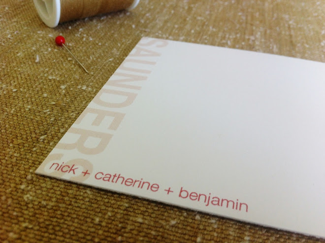
Below are close-ups of the remaining three designs. Clockwise from the left: {2} I used an ornate block font inspired by Ruthy's recommendation, coupled with a really classic serif font for our names. It's traditional with a twist. {3} The "monogram" is oriented in the lower right-hand corner. I used a simple script for our last name and a typewriter font for our first names, which I think provides a nice contrast. {4} I designed this last one with Casey's request for "more sophisticated fonts" in mind. Super traditional, but the placement of the text keeps it fresh.
Here they are again, all together. It's pretty amazing what you can do with typography! Drop me a comment: which style suits YOU best?