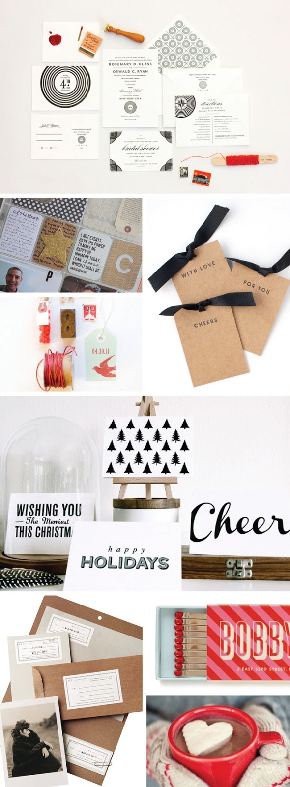
december daily | color scheme
This week, I've been planning out my December Daily album for 2012 (read more about the project HERE). Ultimately, this will be a mini-album documenting our holiday season. In the spirit of being green (and, frankly, frugal!), I'd like to use as many items that I already own as possible to put the album together. But I don't want it to be a mishmash of randomness.
To create a cohesive album, I'm starting with a color scheme. I scoured Pinterest for inspiration and came up with some serious eye candy as well as a palette that really resonates with me this season: black, white, cream, gold, grey, kraft, natural wood tones, red and mint. Yum.
Sources, clockwise from the top // Oswald stationery suite from MaeMae Paperie kraft tags with black ribbon via Tumblr + black and white holiday stationery via In Haus Press divine little bobby pins via Kate Spade + whipped cream "marshmallows" via Pinterest kraft identity suite via CSA Design + mint and red notions via MaeMae Paperie
Project Life page via Elise Blaha
My plan is to go around the house, scour the office closet, dig through stacks of paper, old invitation samples and gift tags searching for any and all items that fit this color scheme. I'll share my findings with you tomorrow. I'm excited to see what treasures I'm able to unearth. Here's to a special little project with minimal impact on my wallet and the environment!
What holiday colors are you digging this season?

